Catacycle is a web-based tool to generate visualizations of the rates of various steps in a catalytic cycle. The user populates a web form using what they know about their reaction, and the tool generates a graphic that the user can then annotate in the editor of their choice with molecular formulas and text to represent their chemistry. The running Catacycle app can be found at www.Catacycle.com. In addition, Organometallics published an editorial that we contributed in October 2019 describing the tool, as seen here.
What is a catalytic cycle?
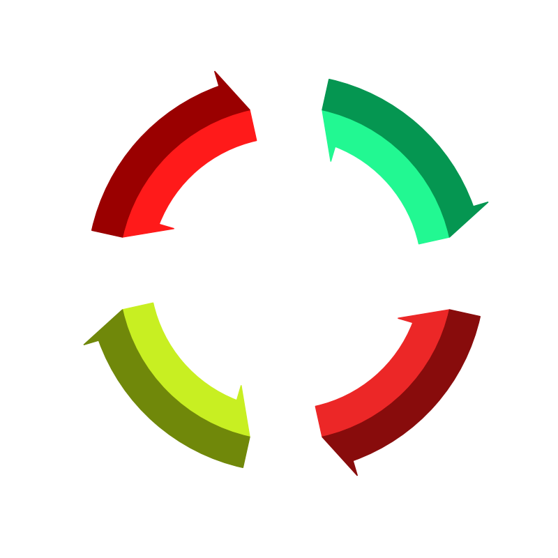
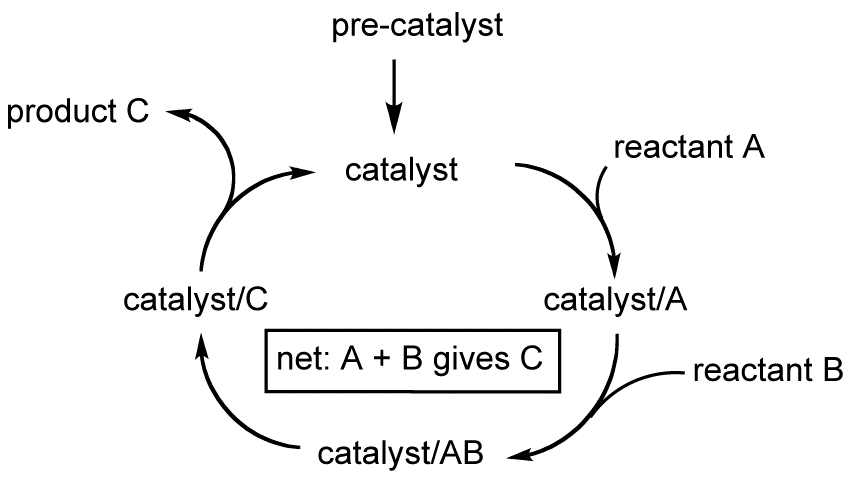
In casual talk, we often speak of a catalyst as think or person that brings about or speeds change. In chemistry, though, the word has a more specific definition. A catalyst is a chemical species that speeds up a chemical reaction without being used up in the process. Basically, a catalyst can cause the molecules that a chemist wants to react to interact in a way that is hard for them to do on their own, often because it facilitates those molecules lining up in just the right way to react (form and break bonds). Usually, the catalyst undergoes a temporary change itself, only to have this change reversed and the original catalyst regenerated. This transformation and regeneration of a catalyst is what we mean when we say catalytic cycle.
This cycle occurs over a few steps, with the reactants going in at one step, the products coming out at another, and the catalyst itself going around and around so long as there are more reactants available to keep the reaction going (this is a simplified picture, but it gets the point across). Catalysis can happen anywhere, from inside the human body (enzymes are just macromolecular catalysts) to the surface of metals, and chemists work hard to understand these reactions and invent new catalysts to speed reactions that are useful to society (like producing ammonia in the Haber process.

Why did we make Catacycle?
Well, it turns out chemists hate tedious, repetitive tasks as much as the next person. I rarely work with catalysis in my own research, but when Professor Scott McIndoe at UVic floated the idea of building a tool to ease the pain of drawing these cycles to fellow computational chemist James MacFarlane and myself, we thought it could be a fun project and agreed to help him out. Scott basically told us, "I've seen a lot of reeeeaaaally ugly catalytic cycles in publications, but I think there's an easier way." Chemists usually use a tool called ChemDraw to generate their cycle figures, and while it is an excellent tool for drawing chemical species and reactions, it can be very annoying to use for drawing a cycle. The arrows can be difficult to align, and often have funky spline shapes. Scott asked if we could help make the cycle-drawing process repeatable and easy and produce images that are nice enough to go in a journal article.
Adding rate information to the cycle
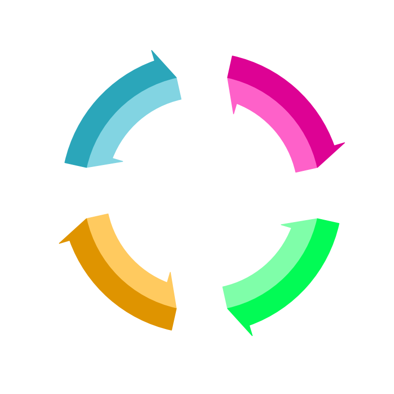
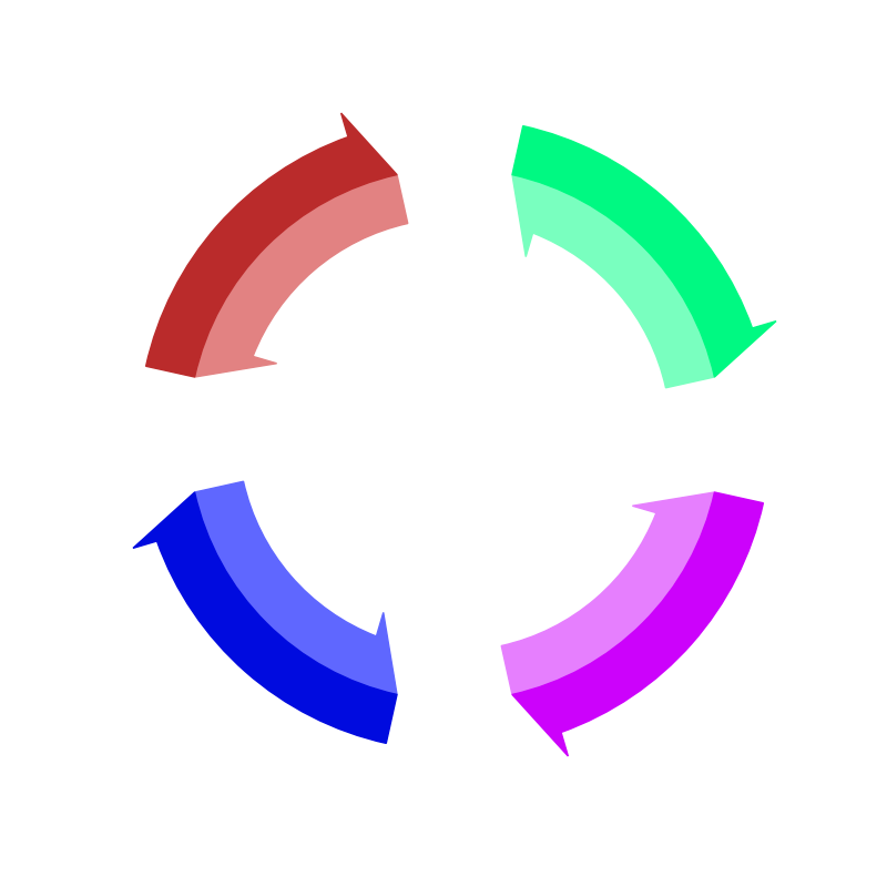
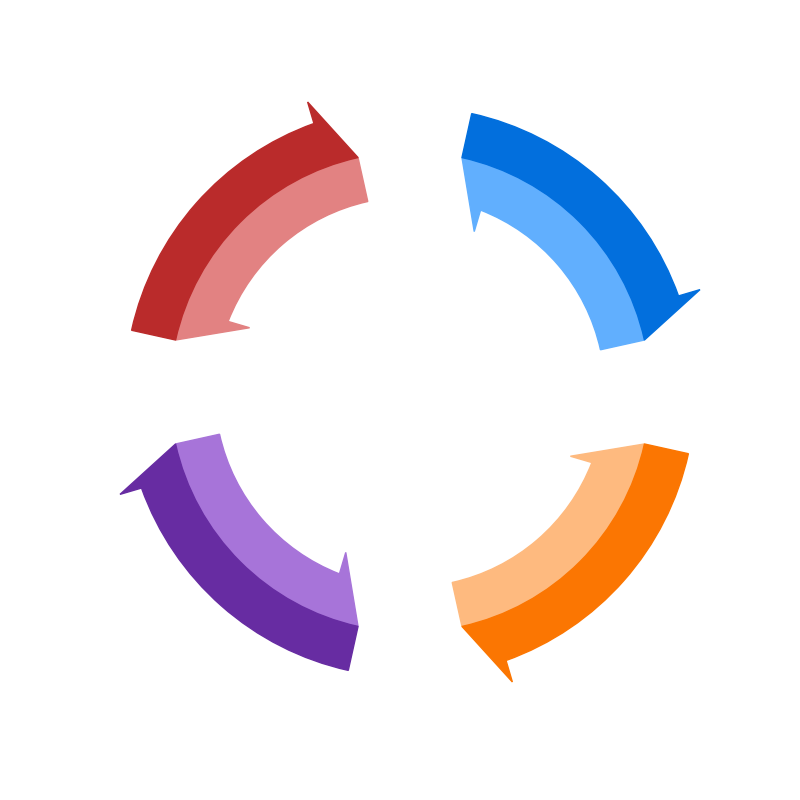
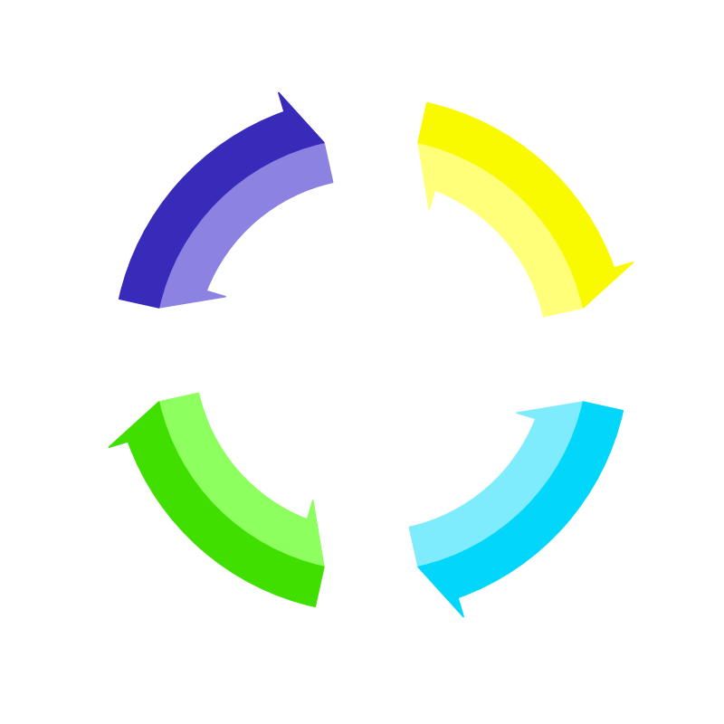
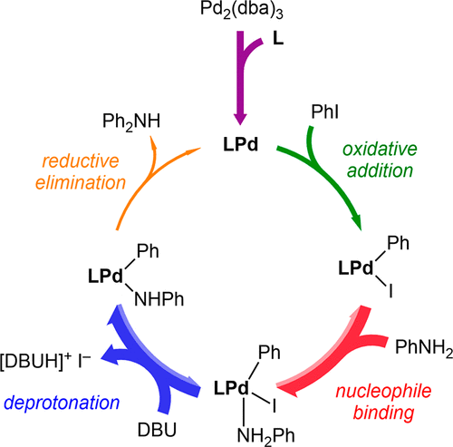
But the other idea behind Catacycle is that it can give a visual representation of how fast each step in the cycle is. Imagine that one of the steps in the cycle is much slower than all of the rest. Then reactants would tend to pile up at that step and the cycle only proceeds at the rate that that single step can turn over, since every subsequent step depends on its output. Think of it like someone placing a dam in the middle of a lazy river, but that dam has a little pipe poked through the middle of it. The overall flow of the river will only be as fast as the water can flow through the pipe under the applied pressure. Similarly, a single slow step in a catalytic cycle can slow the turnover of the cycle as a whole.
Through cleverly designed experiments, chemist often can figure out how fast each step of their cycle would be on its own (of course when all the steps are chained together, they all proceed at the same rate). So we decided to adapt the pipe analogy by representing the rate constant of individual steps with the thickness of the arrow for that step. If arrows were pipes, then reactants could flow more easily through thicker arrows. This representation is merely qualitative, since it can be difficult to compare two rate constants quantitatively unless the rate law, the equation governing the kinetics of a reaction step, have the same form, which is not always the case. Still, putting some visual data about step rates in a cycle drawing can give a quick, at-a-glance sense of which steps are limiting the turnover of the cycle.
How we built it
Catacycle is a web application built with the Python micro web framework Flask and deployed on pythonanywhere.com. Originally, the entire software existed as a single python script for plotting cycles using matplotlib. Because of this legacy, all of the plots in Catacycle are still generated by the Python backend and then served up to the user's browser rather than by a Javascript plotting library like D3.
The Python back-end
Catacycle's drawing capabilities lie in two modules, drawing_helpers and oboros (short for ouroboros).
- drawing_helpers.py contains the implementation of drawing individual arrows using matplotlib functions. Basically, we had to design custom matplotlib paths for the specific types of curved arrows that we needed.
- oboros.py strings together the drawing functions to create a cycle and returns an image which can be passed as a response back to the webpage for display.
Some Examples
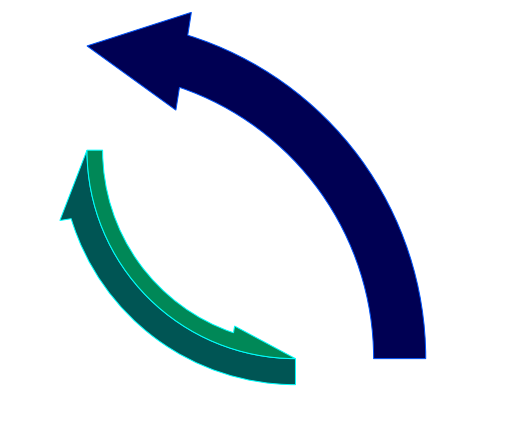
Catacycle's drawing functions can be imported in other python scripts as well or used in a Jupyter notebook. For example, if you wanted to add a customizable curved arrow to another matplotlib plot you had, you could import the drawing_helpers module and use the curved_arrow_single() function. Perhaps you'd do something like
import matplotlib.pyplot as plt
from drawing_helpers import *
from oboros import draw_cycle
import matplotlib.patches as mpatches
# create a figure
fig = plt.figure(1, figsize=(8,8))
ax = fig.add_subplot(111)
# parameters go start angle, end angle, radius, width, and then keyword args
arrow_path = curved_arrow_single(0, 90, 3, 0.5, origin=(0,0), rel_head_len=0.2, rel_head_width=1.9, reverse=True)
arrow_patch = mpatches.PathPatch(arrow_path, facecolor='#000055', edgecolor='#0055FF')
ax.add_patch(arrow_patch)Maybe you also needed a bi-directional arrow! This time, you can get the paths for both the forward and reverse arrows with curved_arrow_double().
# parameters go start angle, end angle, radius, outer width, inner width, and then keyword args
f_path, r_path = curved_arrow_double(180, 270, 2, 0.25, 0.15, origin=(2,2), rel_head_len=0.2, rel_head_width=1.9)
f_patch = mpatches.PathPatch(f_path, facecolor='#005555', edgecolor='#00FFFF')
r_patch = mpatches.PathPatch(r_path, facecolor='#008855', edgecolor='#00FFFF')
ax.add_patch(f_patch)
ax.add_patch(r_patch)
To display it all, use the set_ax_lims() helper function and display the plot like you would with any matplotlib figure.
set_ax_lims(ax, [arrow_path, f_path, r_path])
plt.axis('off')
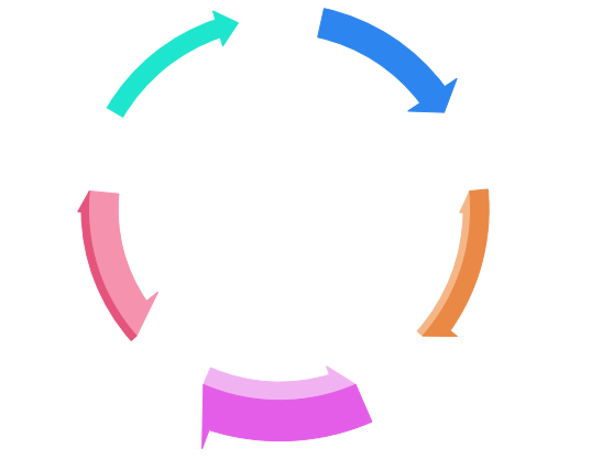
plt.show()Taken altogether, these code snippets should yield something like the left-hand figure below. This is kinda neat, but if you wanted to create an entire cycle manually, it could get a little tedious. That's where the oboros module can be handy, since it defines the helpful draw_cycle() function. There are a lot of parameters to mess with here, but I've only shown a few. For example, if you wanted incoming and outgoing arrows, you would need to add 'is_incoming' and 'is_outgoing' boolean lists to the data dictionary, where each item tells whether the arrow of that index in the cycle has an incoming or outgoing side arrow. Below is a pretty simple example of a cycle with 5 steps. Commenting out lines of the data dictionary will revert to default options.
fig = plt.figure(1, figsize=(8,8))
ax = fig.add_subplot(111)

data = {
    'num_steps': 5,
    'forward_rates': [3.0, 2.0, 4.0, 1.0, 2.0],
    'rev_rates': [0.0, 1.0, 2.0, 3.0, 0.0],
    'fcolours': "#4286f4 #e2893b #de5eed #dd547d #4ee5ce".split(),
    'rcolours': "#82abed #efb683 #edb2f4 #ef92ae #91f2e3".split()
}

paths = draw_cycle(data, ax, radius=3.0)
set_ax_lims(ax, paths)
plt.axis('off')
plt.show()
The Front-end
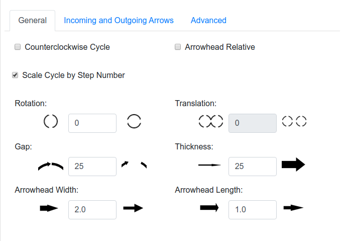
Designing the front end of Catacycle was one of my first experiences designing anything for the web, so I tried to keep it simple. Using bootstrap for styling, I created a web form styled as a multi-tab bootstrap card. This form allows the user to configure all of the data and styling attributes of their cycle.
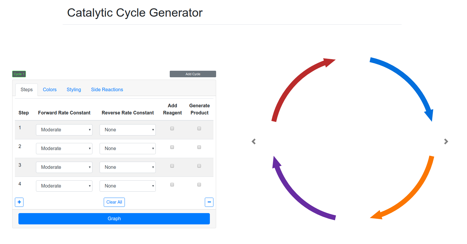
Whenever the user hits the "Graph" button, an asynchronous ajax post request is sent to the python backend with all of the data contained in the styling form. This data gets formatted as a python dictionary and input to the draw() function within oboros.py. The resulting svg is returned as a response, and the javascript replaces the old cycle image with the new one. As shown in the demo section below, it's possible to create some pretty intricate cycles, including two intertwined cycles.

Drawbacks and possible directions
Because of this back and forth to the server, we have found that there can be some lag in updating the cycle depending on the speed of your internet connection. Additionally, since the image is simply a static svg, we haven't been able to implement the sort of interactivity we would like with it. In an ideal world, a user would be able to hover over or perhaps click on an arrow in the cycle, and a list of options would pop up, allowing the user to change the data and style of individual arrows intuitively. Perhaps the user could just click and drag the end of an arrow to lengthen or shorten it, all the while having all arrows stay on the circular template which keeps the cycles looking clean, for example.
I think that this interactivity could be achieved if we ported over the python plotting code to a javascript plotting library like D3. Although it has a notorious learning curve compared to matplotlib, D3 would allow us to have a responsive cycle and eliminate the lag from waiting for the server to respond with updated cycles.
Demo
Here is a quick screencast showcasing the major features of Catacycle. In it, I add and remove steps, change arrow colors and styles, add a second overlapping cycle, and download the final product.
Where the Code Lives
The Catacycle code is available on github, which also contains instructions for installing it on your own computer in case you would like to play around with the code.